
Why Color Accuracy and Ergonomics Can’t Be Overlooked
Share
In today’s digital age, monitors are more than just portals to our work—they’re extensions of our creativity, productivity, and physical well-being. Whether you’re a graphic designer perfecting a brand’s visual identity or an office worker crunching numbers, two factors play a pivotal role in shaping your experience: color accuracy and ergonomics. While one ensures your work looks impeccable, the other ensures you feel comfortable while doing it. Let’s dive into why these elements matter more than you might think.
The Critical Role of Color Accuracy
What Is Color Accuracy?
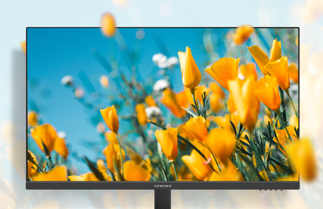
Color accuracy refers to a display’s ability to reproduce colors as they’re intended to be seen. Measured using metrics like Delta E (a lower value means higher accuracy) and adherence to color spaces like sRGB or Adobe RGB, it’s the difference between a vibrant, true-to-life image and one that looks washed out or unnaturally saturated.
Who Needs It?
Professionals in visual fields—photographers, graphic designers, videographers—rely on color-accurate monitors to ensure their work translates consistently across devices. For instance, a logo designed on a poorly calibrated screen might appear too bright on a smartphone or mismatched in print, leading to costly revisions and client dissatisfaction.
The Cost of Inaccuracy
Imagine a photographer editing wedding photos on a monitor that skews blue. The final prints, rendered with a yellow tint, could devastate both the artist and the client. In industries where precision is paramount, color errors damage reputations and budgets. Even outside creative fields, inaccurate colors can affect how data is interpreted in sectors like healthcare or engineering.
Achieving True-to-Life Colors
High-quality monitors with factory calibration (e.g., Delta E ≤ 2) are a start, but regular calibration using tools like X-Rite or Datacolor devices is essential. Software solutions, such as Pantone Connect, also help maintain consistency. Investing in a monitor with 99%+ sRGB or Adobe RGB coverage ensures a broader color spectrum, vital for print and digital media.
2. Ergonomics: More Than Just Comfort
Defining Ergonomics in Tech
Ergonomics focuses on designing products that fit the user’s needs, minimizing physical strain. For monitors, this means adjustable stands, eye-care technologies, and designs that promote natural posture.
Health Implications of Poor Ergonomics
Staring at a poorly positioned screen for hours leads to digital eye strain (symptoms include dryness and headaches) and musculoskeletal issues. The American Optometric Association reports that 50–90% of screen users experience eye strain, while slouched postures contribute to chronic neck and back pain. Over time, these issues can result in absenteeism and reduced productivity.
Features That Make a Difference
· Adjustability: Monitors with height, tilt, and swivel adjustments allow users to align the screen at eye level, reducing neck strain.
· Blue Light Filters: Excessive blue light disrupts sleep cycles. Monitors with low blue light modes or certifications like TÜV Rheinland help mitigate this.
· Flicker-Free Technology: Eliminates screen flickering, a subtle contributor to eye fatigue.
· Anti-Glare Coatings: Reduce reflections, making it easier to focus in brightly lit environments.
Boosting Productivity Through Comfort
An ergonomic setup isn’t just about health—it’s about efficiency. Comfortable workers are less distracted by discomfort and can maintain focus longer. OSHA highlights that ergonomic improvements can increase productivity by up to 25%, proving that comfort and performance go hand in hand.
3. The Intersection of Color Precision and Ergonomic Design
Do They Complement Each Other?
At first glance, color accuracy and ergonomics seem unrelated. However, professionals need both to thrive. A designer might produce stunning work on a color-accurate monitor, but without ergonomic adjustments, they can’t work long enough to perfect it. Conversely, a comfortable setup means little if colors are off, leading to rework.
Monitors That Balance Both
Viewedge offer 2K displays with factory calibration and ergonomic stands. These models cater to creatives and professionals who refuse to compromise. Features like USB-C connectivity also streamline workflows, reducing cable clutter and further enhancing comfort.
4. Making the Right Choice
When selecting a monitor, assess your primary needs:
Creatives: Prioritize color gamut coverage (Adobe RGB for print, DCI-P3 for video) and calibration tools.
Office Users: Focus on adjustability and eye-care features.
Hybrid Users: Seek balanced options, like IPS panels with ergonomic stands.
Ask yourself:
- What’s my primary use?
- How to Choose the Perfect Display for Your Needs Introduction?
- Which Monitor Specs Boost Performance and Enjoyment?
- Will I need HDR or ultrawide features?
Remember, a higher price tag often reflects better build quality and longevity. Over time, investing in both aspects saves money by preventing health issues and ensuring work accuracy.